The ultimate checklist for captivating alcohol label design
Follow Outshinery's expert guidance to ensure that no details have slipped your mind!
If you're a winery, brewery, or distillery striving to make your mark in a crowded marketplace, you know that first impressions count. Your label design is one of the most powerful tools you have to catch the eye, tell your story, and persuade customers to choose your bottle over the competition.
Alcohol is all about the sensory experience: the taste, the aroma, and the visual impact it creates. A label serves as a branding tool and plays a critical role in influencing consumer decision-making. So, it's essential to create striking packaging that stands apart from the competition.
In this post, let's explore the ultimate checklist for alcohol label design that sells.
Here’s what you’ll learn:
- Craft your brand identity
- Use color wisely
- Choose the right typography
- Utilize compelling imagery
- Validate your design against market trends
- Assess design effectiveness
Define your brand personality
Crafting a distinctive brand personality is essential for every successful brand. Are you aiming for a traditional or modern vibe? Is your brand bold or subtle? Luxury or budget-friendly? Ensure that your label design captures and reflects your brand's personality while resonating with your target audience.
Defining your brand identity is the first step towards creating a memorable label. This encompasses your brand story, core values, and unique personality. The label design should effectively convey your brand's identity and evoke emotional connections with consumers. Start by creating a mood board featuring carefully chosen colors, textures, and fonts that align with your brand's essence and vision.

Choose a color scheme that evokes emotion
The choice of color can have a profound impact on consumer behavior and purchase decisions. It's important to carefully select a color scheme that aligns with your brand's personality and evokes the desired emotions in your customers. For instance, the color red can symbolize passion and boldness, while green can suggest freshness and organic qualities. It's crucial to use colors thoughtfully and strategically.
The color palette plays a vital role in label design, as it has the power to sway consumer choices. Opt for colors that evoke emotions and resonate with your brand's identity. For instance, red signifies boldness and passion, while green represents a sense of natural and organic. Feel free to experiment with different color combinations that make your products stand out on the shelf.

Choose fonts that make a statement
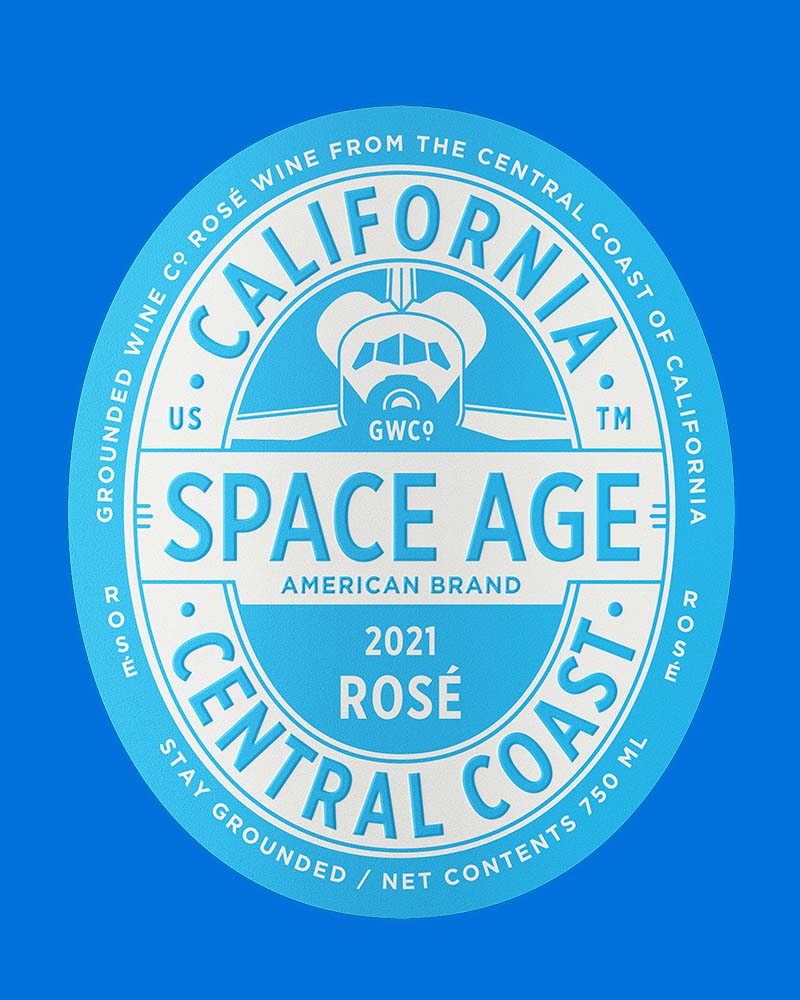
The typography on your label should be not only legible but also visually appealing and reflective of your brand's unique character. Whether you prefer a timeless serif font or a more modern sans-serif option, make sure it harmonizes with your overall design and effectively communicates your brand's message.
Typography plays a pivotal role in packaging design, defining your brand's personality and aiding in information hierarchization. Traditionally, wineries opt for elegant script fonts with a sense of luxury and sophistication. However, sans-serif fonts can also be a great choice if you want to infuse a contemporary touch into your design. Consistency in font usage across all your brand's sales channels and platforms is key.
Elevate your label's impact by carefully selecting typography that commands attention and captures the essence of your brand.

Incorporate imagery that tells a story
The imagery featured on your label, whether it be a logo, illustration, or photograph, holds tremendous power in conveying the story and values of your brand. A single picture can communicate more effectively than a thousand words. This rings especially true for labels on wine, beer, or spirits. The imagery utilized on your label goes beyond mere decoration; it serves as a captivating visual narrative that captures and communicates your brand's unique story, values, and distinctive selling proposition in a way that words alone cannot match.
In a crowded marketplace, captivating imagery can be the defining factor that sets you apart from the competition. It can mean the difference between blending in with the rest or standing out as the top choice for customers. To achieve this, why not leverage the expertise of high-quality product photography services like Outshinery? They can expertly capture the essence of your brand and present your beautifully designed labels in the most flattering light possible.

Validate your design against market trends
In the ever-evolving world of wine, brewery, and distillery marketing, staying updated with the latest trends in label design is not only beneficial but essential. While it's important to stay true to your brand's identity, validating your design against current market trends ensures relevance and competitiveness.
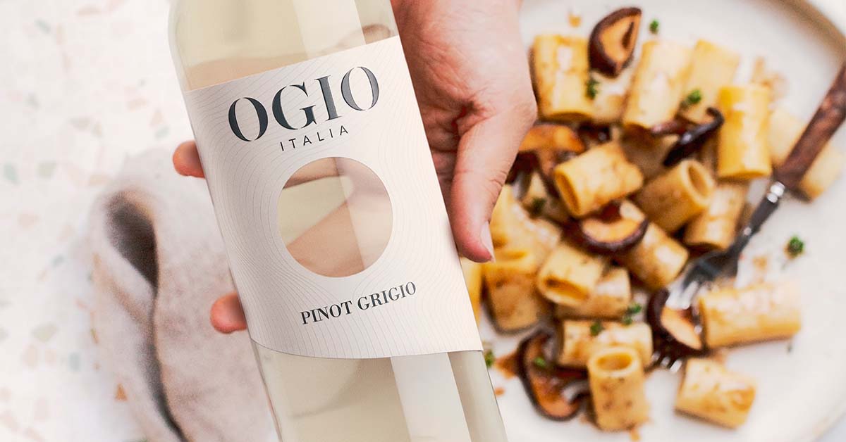
Take, for example, the rising popularity of minimalist design in wine labels. This trend captures the desire for simplicity and authenticity among today's consumers. By incorporating high-quality product photography, you can communicate your brand's commitment to transparency and quality.
Additionally, the increasing prominence of eco-friendly materials reflects growing consumer awareness and concern for environmental sustainability. By integrating these elements into your design, you showcase your brand's environmental responsibility, enhancing reputation and appeal among eco-conscious consumers.
However, validating your design against market trends goes beyond blindly following the crowd. It's about strategically aligning your brand with trends that resonate with your core values and target audience. By demonstrating that you're in tune with your customers' evolving tastes and expectations, you can distinguish yourself from the competition.
Stay true to your brand, embrace market trends, and design labels that speak to the hearts of your consumers.

Measure the Impact
Once your new label design hits the market, it's crucial to assess its impact on sales and customer perception. By analyzing pre and post-launch sales data, we can help you gauge its direct influence on your bottom line. Did your sales go up? If so, by what percentage? These measurable outcomes are just some of the rewards you can anticipate when you invest in our top-notch product photography services.
However, the impact of your label design goes beyond numbers. It goes hand in hand with how your customers perceive your brand. Through feedback on social media, customer reviews, and focus group discussions, we can evaluate the emotional response your new design elicits. Is it striking a chord with your target audience? Does it effectively convey your brand's story?
For instance, if customers are praising the authenticity conveyed through the imagery on your label or if they're sharing your product on social media because the label catches their eye, these are positive signs that your design is making an impact.
Lastly, measuring impact is an ongoing process. It involves assimilating these insights to continuously refine and enhance future designs. For example, if your minimalist design resonated well with millennials but not with baby boomers, this valuable understanding can shape your design strategy for different product lines aimed at diverse demographics.
In conclusion
It is important to remember that a thoughtfully crafted alcohol label holds immense marketing potential. Such a label can help your brand shine, foster connections with customers, and ultimately drive sales. Instead of leaving this crucial aspect to chance, consider investing in professional design and product photography services to ensure your wine label truly stands out.
Creating packaging that captures the essence of your brand and resonates with consumers is indeed a challenging task. By following this checklist and focusing on vital elements such as typography, color scheme, and label materials, you can craft wine labels that leave a lasting impression on the shelf. So, let your creative side flourish and design an extraordinary label that embodies your brand's identity.
Key takeaways
- Design strategies should be catered to resonate with various demographic segments.
- Consistency in typography usage across all branding platforms is crucial for a modern and cohesive brand image.
- The imagery on your label serves as a visual narrative that communicates your brand's unique story and values and can set you apart from the competition.
- Staying updated with the latest design trends is essential for maintaining brand relevance and competitiveness.
- Measuring the impact of your new label design on sales and customer perception is vital for gauging its effectiveness and refining future designs.
- A well-crafted alcohol label can serve as a powerful marketing tool, fostering connections with customers and driving sales.
- Professional design and product photography services can be worth investing in to ensure your wine label stands out.

